Thursday 8 October 2009

YooBot

Having done some work with the British Heart Foundation during my time on placement, I was excited to see what the next installment of Grey's campaign for the BHF was going to be. Knowing they were targeting a younger market I was pleasantly surprised to see the "Yoobot" site. A yoobot is a virtual you, you put in your age and register, you can even upload your face as a picture! Your yoobot gets to live your life, basically, online and through your actions, you can see how the yoobot is affected, for example if you feed it too many burgers, you can see it become ill and even die!

I think this is a great site to teach children from a young age about heart disease, especially with obesity become such a large problem for the youth of today. Its fun for us bigger kids too! Go to http://yoobot.co.uk/ to try it out!
Wednesday 7 October 2009

Etsy

This is a website that I have been aware of for quite a long time, but have only remembered recently. It is a site sort of like ebay but instead of selling everything, it is a community for artists to sell their wares. It is also a social network where artists can communicate with each other and see what's going on.

I think it is a great site because of the handmade, community aspect, it is kind of like a family. I have bought a few lovely things on there, and is somewhere different if you are looking for that personal gift. So go on etsy.com and browse away!

Waltz with Bashir

aWaltz with Bashir is an animated film made in 2008, and tells the story of a soldier who fought in the first Lebanon war in the 1980's. He has completely lost his memory excpet for a recurring nightmare he has about 26 dogs chasing him.

This film is a really interesting way of looking at war. does making it animated make it more accessible to the public? Does it make the film appeal to kids more? Does it make politics more real, and more people interested in politics?

I definitely recommend this film for anyone who is interested in animation (like I am) and also those who are interested in politics, or the Middle East.

Thursday 1 October 2009

Fame

I went last night to see Fame, a remake of the fantastic 1980 film set in a New York school of performing arts.The original movie poster

Now, being an absolute Fame original devotee, I was expecting a lot from this "re-invention" of, in my opinion, a classic!

I'm usually not a fan of remakes, with films such as "The Italian Job" falling short of their originals.
Fame reminds me why I'm not a fan of remaking the classics. It really did not live up to the original. The set, songs, actors and plot were all there, but somehow did not fit together quite so perfectly. There was definitely something lacking, and I think it was the plot. It went all too quickly and there was hardly any character development.

This film had none of the earlier grittiness of the original, and the characters had just a tad of Hollywood sparkle about them, which didn't really fit with the earlier film.

I also think that the characters were exaggerated too much, you had the really shy introverted girl who dressed like a nerd, the typical wacky director who had the same glasses as every other cool nerd from american films, and the not-pretty-but-beautiful girl who doesnt know her own talent.

In the end, the film just didnt strike the same chord with me as the original, and I think others felt the same.

Thursday 27 August 2009

Ikea

Sorry I haven't blogged in a while, i've been away running a youth camp for my job, and now that i'm back, i'm leaving for America in a few hours! Thought I would share something interesting with you before I left..... IKEA'S NEW TYPEFACE! And believe me I was shocked! After years of using their own style of Futura, Ikea has decided to switch to using Verdana. Some have expressed disbelief at Ikea using a typeface which is usually seen as a text face on our computer screen, and declare Verdana too ugly for display use! So why the change? Having found this piece of news on Typophile, who point out that the company's founder is cheap, which probably motivated the switch as Ikea moves into more markets that require better language support from its corporate fonts. Verdana already has extensive multi-lingual support, and it's available on all the computers throughout the company at no additional cost. In my opinion, its a bit of a shame that Ikea have changed their typeface, as their own version of Futura was Ikea, a and they had built up their brand.


Before and After

There are a few people commenting on this change,

Designer James Puckett questioned the financial common sense of that decision, saying:
"I would argue that making such a dramatic change to the visual identity of such a valuable brand has potential costs that are much higher than the cost of extending Futura to cover more languages. If Ikea has to do one big ad campaign in the US and Europe to reinforce the new identity, they might spend more than they would have to extend Futura."

St. Thomas art history professor Craig Eliason tries to reason why Ikea have made the switch, and said that it might be to sync up with "web-immersed" young audiences, who "might feel subliminally quite at home in a store filled with Verdana."

We shall see in the future if this change has any effect on Ikea's sales and their brand identity!

Wednesday 12 August 2009

Did You Know

Came across this great presentation which gives the most incredible facts, and it does it in a really interesting way too. Watch this and be astounded!


Monday 3 August 2009

GLOG Faces!

It always seems like cups should have faces, and here, some bright spark has really put a face on a lid. The poor thing looks so put out with having the straw in its eye, it really accentuates the expression!

Wednesday 22 July 2009

Tango (with added tango)


Today in the corner shop, i found this lovely new Tango product, called "Tango with added Tango." I wondered what this added ingredient could be, so I excitedly purchased this can, which was 59p for 440ml as opposed to the usual 330ml. When I got back to the office, a colleague and I pondered over what this mystery ingredient could be, then realised what morons we were and that the added Tango was actually the added liquid!!

I thought it was really cool that they were giving extra product for the same price. The design of the can is also slightly different, for the new product they have added a faux warning label, with a helpline to call, like the old Jaffa Cake packets.


They've also added a couple of touches, for example in the ingredients section, it describes Tango as an "orange soft drink with sugar and sweeteners. contains no artificial colours or flavours (or any of those poncy ingredients like ginseng or elderflower.")
They are obviously trying to cater to a specific type of market, like Yorkie bars.

I think its a good thing that customers are getting more for their money in these recession-ary times but i'm not sure if more sugary products is such a good thing!

Tuesday 21 July 2009

Yahoo Makeover

Search engine giants Yahoo have this week launched the new interface of their website. Yahoo first announced that it would be redesigning their layout in May 2006, and slowly started rolling out changes a year later.

Obviously it hit the USA first and it is slowly being integrated into the European and Asian countries. The main difference is that it is a lot more spaced out, there is more information but instead of being crammed into a s
mall window, it is tabbed and split into sections. "We are looking at Yahoo holistically, all centred around the user," said Yahoo's consumer experiences head Tapan Bhat. This means that everything you need is just a click or two away, with links to other sites such as BBC News, or even Twitter and Facebook.

The new layout can also be customised, and tailored to fit the individual and their online needs.
Yahoo has described the overhaul as the most "radical" and "fundamental" make-over of the site since it began more than a decade ago, and you can see why. Gone is the jumbled and cramped layout, and instead everything looks busy but in a good way, and at least the user can see what is going on in the world. I have to say I am a fan of the new look of Yahoo, and though I haven't previously used it, I think I might start doing so as everything is all in one place! From this:
To this:


Sunday 19 July 2009

Yad Vashem

Yad Vashem is the Holocaust memorial museum in Jerusalem, Israel. I've been to many war and holocaust museums all over the world, for personal research as well as set work. However, Yad Vashem is probably the most interesting of them all.

The first interesting thing to note is the architecture. It is a concrete triangular prism that juts over the edge of a mountain, with the far end a skylight open to the elements.

From the inside you can see right through to the end, giving the impression of a long journey through the mountain which culminates in a light at the end.


There are rooms off each side which have more information and multimedia interactive exhibitions.

Yad Vashem is the world's leading Holocaust museum, which continues ongoing research into the holocaust, and even raises awareness about genocides in other countries. Millions of people visit each year, and having been myself 3 or 4 times, there is always something new which opens my mind up about different things. It is a fantastic museum and learning centre, and if you are ever in Israel, you have to visit it.

Resident Evil

I'm not really a fan of these horror films that cross over into gaming, but I came across this campaign for Resident Evil and actually thought it was quite clever, amusing too.


The only problem is I haven't seen any of these around, but apart from that I think its a great idea, if I was in charge of this campaign I think I would get everyone to do a kind of flash-mob style event, like the recent and effective T-Mobile adverts.

Wednesday 15 July 2009

Harry Potter and the Half Blood Prince


After a year of waiting, its finally here! Today I queued up for an hour to see the long-awaited film of the 6th installment of the Potter series. As an avid Potter fan, I expected a lot from these films, having loved the books and been slightly disappointed with the early HP films.

I have to say, this film doesn't disappoint. It has everything you wanted from a Potter in it, Quidditch, romance, violence and more. I laughed at the awkward comedy of the great British cast, and was at the edge of my seat during other points in the film.

I really really loved this film, I thought it was great, and the effects were unbelievable! Right from the beginning where we see the Millennium Bridge destroyed until right up to the last few minutes of the film (no plot spoilers dont worry!) the animation was flawless and so real looking!

The directors have played around with the storyline a little, but I definitely think this was necessary to give the characters more depth, and the film more of a product in its own right.

My recommendation: if you are a Potter fan then this film is a must, but even if you aren't, its still a great film and very entertaining!

Tuesday 14 July 2009

Shepard Fairey

Shepard Fairey is an artist, graphic designer and illustrator from the USA, who made his name whilst still studying. He created the "Andre the giant has a posse" sticker/ambient media campaign in 1989, work which still has influence and relevance today, with many spin-offs on his original sticker still around. However it is Fairey's more recent work that i'm interested in. He was the one responsible for creating Barack Obama's "Hope" campaign, reaching people all over the world. This was probably one of the most influential American political posters since the World War II "Uncle Sam Wants You" campaign. Fairey helped Obama become a national icon and an inspiration to others.
Fairey worked his way up, from the skateboarding music scene, and getting arrested for graffiti art to a highly successful designer, creating his own agency specialising in ambient media, working with clients such as Pepsi and Netscape. He has really done some incredible things, from designing to DJ-ing, so I would encourage you to check out more of his work. (You can visit the OBEY website here.)


Monday 13 July 2009

Post It


Wow... this must have taken him ages! The above is a post-it stop motion video, incredibly well made, fits with the music, there are just so many things right with this little film.

Director Bang-yao Liu says of his film: "This is my senior project at Savannah College of Art and Design. Where my idea comes from is that every time when I am busy, I feel that I am not fighting with my works, I am fighting with those post-it notes and deadline. I manipulating the post-it notes to do pixel-like stop motion and there are some interactions between real actor and post-its."

Lost something?

This is so cool, Sara Watson, a drawing and image making student from the University of Central Lancashire turned her old Skoda invisible but painting it just to look like the car park and out side of her drawing studio.

When the car is photographed from one angle it almost look invisible. This takes me back to Prof Hann's lectures on art and perspective. This is a really innovative way of bringing the age-old principles of geometric art and design right into our lives, and it looks incredible!

Thursday 9 July 2009

I Fancy A Snog...

No no... not that kind of snog! The Snog i'm talking about is delicious, cold and creamy... did you guess it yet?
Snog is a new chain of frozen yogurt shops, that have opened across London. I'm not blogging about the product however, but the website. Go to ifancyasnog.com or just click here for a really lovely web experience. The site's colour scheme is the first thing that really stands out, with sepia imagery and bold fuchsia contrasting to draw the eye. Snog uses a range of characters to tell you about the product and entice you to try it.

The website is very simple, letting the product speak for itself. There are loads of interesting things to do on the site, apart from learning about Snog. You can follow their blog, enter competitions and even see the other companies or people Snog endorse.

The tone of voice used is humorous,
bordering on the slightly sarcastic, and is in keeping with the look and feel of the website.

The website reflects the natural, quirky shop decoration as well, with the illustrations used in the Snog outlets also used on their Twitter page. I really like how everything ties in, and enjoyed not only viewing the Snog product, but their ethos and even lifestyle. I hope to have my very first Snog soon!

Wednesday 8 July 2009

Laika

LAÏKA (SHORT VERSION) from Guillaume Blanchet on Vimeo.


The above is a short stop-animation video titled Laika. Stumbling across this on the internet, I had no clue what the video was about, apart from the name. Laika was the name of a dog, the first earthling ever sent into space.

However, delving deeper into this fantastically well made, cute and funny video, I discovered that the guy who made this works in a bar in Montreal called Laika, and it was for its tenth anniversary. 3 minutes is quite a long time to watch a simple piece of animation, but this really draws you in, the eclectic music also fits so well. Its a really interesting way of celebrating an anniversary, and I will look out for more of the artist, Guillaume Blanchet's work.

Tuesday 7 July 2009

One and Other

Antony Gormley’s new work in London is the project "One and Other," which sees the Fourth Plinth in Trafalgar Square occupied for 100 consecutive days, 24 hours a day, by members of the public who have volunteered to stand on it for an hour at a time.


This is really an incredible thing, being that the plinths are normally reserved for royalty, and famous servicemen, Generals and the like. I think the idea behind One and Other is not just to represent one person, but to represent humanity.

The people chosen are allowed to do whatever they like on the plinth, whatever it is that they think will provoke a reaction, or what they think represents themselves.
You can observe the plinth via webcam on the website, just click here.

I think this is a fantastic project, allowing the public to catch just a glimpse of what makes someone else tick. I think that this is a project that will be celebrated, as I can imagine Gormley putting a massive variety of people on the plinth. In the spirit of humanity, I have also entered the draw to stand for an hour, so hopefully I will get a go!

Monday 6 July 2009

When the Shark and the Fish First Met


When the Shark and the Fish first met is a story written by Gilad Shalit, aged 11. Gilad writes about a young fish who meets a young shark. Although natural enemies, they decide to become friends and live in peace.

You may ask why this eleven-year-old's story has become so important that it has been turned into a book, with illustrations from many famous artists. This answer lies in the story of Gilad Shalit.

Gilad's Story:
On Sunday morning (25 June 2006) in the course of an infiltration and attack by terrorists in the area of Kibbutz Kerem Shalom, on the Israeli side of the border with Gaza, an IDF officer and a soldier were killed, a soldier was abducted, and four others were wounded. Gilad Shalit, then 19, was the Israeli soldier abducted. Since that time, he has been held captive by Hamas in the Gaza Strip.

This story of a shark and a fish overcoming obstacles and becoming friends, making peace has become hugely important and central to the campaign to release Gilad and all of Israel's missing soldiers.

Gilad's story has been turned into a book, and had been put on the curriculum for many schools in the USA. Below is some school children reading Gilad's story, accompanied by some of their drawings. Alternatively, you can watch the video here.


I am posting this for the 3rd anniversary of Gilad's capture.

Nu!


Nu!... or so?! in Hebrew is a campaign run by Israelis in the town of Sderot, which is bombarded daily with rockets from the Gaza strip. This campaign not only is trying to to raise awareness of the plight of the people in Sderot, but is trying to connect people to the human stories behind the headlines.

To quote Nu; "By using art and creativity through apparel, we hope to foster awareness and activism. Each story will be told through stimulating graphics and text that will appear on the inverse of the shirt—directly in line with the heart, where the NU Campaign stems from.
"

This is a unique and thoughtful way of bringing something from so far away into our consciousness. The current tshirts have a graphic showing the number 15 on them, because
Sderot residents have 15 seconds to run for cover from the time a rocket is launched and the air raid siren sounds, until the rocket hits its target.

Wednesday 1 July 2009

We've all been watching the adverts for ages, and at first it was quite funny, with a very catchy theme tune, even if it does border on the slightly annoying. Anyways, I finally got bored enough to go and compare meerkats!

The site was suprising, interesting, and above all, funny! You get to choose different meerkats by selecting size, hobby and location. Its a time-filler for about 10 minutes whilst you have a good laugh, then its enough!

However, its a really effective advert, by using silly humour, I think it appeals to a lot of people. Go to comparethemeerkat.com for a browse.

Pop (up) Store

Today I was in Brent Cross, a shopping centre in north London, and was suprised to find "Pop Store" in place of Fat Face. I had a look inside and discovered that it was a pop up shop, or the first "Pop Store." I spoke to the owner, a lovely Australian who was happy to tell me about this, the first shop, and of his plans to set up others, in greater London, then move down to Bristol.

Inside, it was quite a bare space, with a few graphic art pictures on the walls. I loved the changing room door, which was a car door. It stocks quite kitsch, cute clothes for guys and girls, and isn't really in keeping with the rest of the shopping centre, but I really liked it! The owner told me of his plans to turn the shop into a forest in its next locations, and buy more art for the walls.

All in all, it was a really cute shop, with a few designers I hadn't heard of. I liked the stock, and even persuaded the owner to take a trip up to Leeds to see if it would work up there! Its only open for another 3 weeks so go have a look whilst you can!

Monday 29 June 2009

Alan Keys

It's always nice to see a bit of fun and humour in a design, and here Pete Dungey has done just that. He's only a second year student so I feel humbled that he has done something worthy enough to be posted on a few websites!

Stella's big raquet

So, even though i'm not a big tennis fan, no one can escape the hype of Wimbledon. However, I wasn't focusing on the tennis, instead I couldn't help but notice the big fuss that has been made over Stella McCartney's new season tennis dress.

It really is a gorgeous looking thing, beautifully made, with all the right materials used for the court, including mesh for ventilation, whilst retaining a very pretty and feminine design. No wonder amateurs are clamouring for this dress, it can't help but make you look so professional!

Saturday 27 June 2009

French Postal Advert


This is an advert for the French postal service, unfortunately I dont speak the language but it looks like an advert for tracking packages on the web.

This is a really good example of how ordinary things can be transformed into really amazing adverts! Its quite topical too, reminds me of the Transformers movies, one of which is coming out this summer.

Anyways, its really cool so have a watch!

Wednesday 24 June 2009

Bruno....

As a lover of Sacha Baron Cohen's brilliant comedy sketches, I loved Borat the movie, released in 2006. This is why I was greatly excited to see that he has made a movie, with one of his best characters, Bruno! The film is out this summer, and I cant wait to see it.


If you liked this, and Borat, check out Sacha as chat show host Ali G! Below are some of my favourite clips:


He really is a comic genius, so enjoy!

OMGPOP


If you're into online gaming, then this site is for you! Its got loads of fun games, and the site is designed really well too. You can play against your friends or anyone else. OMGPOP combines social networking with gaming.


I would really encourage you to check it out, you can waste hours on this site - omgpop.com

Brand Spanking New Website

This year I have been on my Year in Industry, the majority of which has been spent working for charity/youth movement BBYO. I came on board and was given the broad title of "Fieldworker" which didn't really have a defined role. I took it upon myself to take on all the marketing/design, as this wasn't something BBYO ever really addressed before.

Something that has been a project of mine for the past couple of months has been the BBYO website. Our website had been taken offline as one of the volunteers wanted to work on it, however, after 6 months of a site with no content, I decided to take matters into my own hands.

I have been working with a professional web designer to create the new BBYO website, and put together most of the content and designed the look of the site. There was much development, but I am very happy with how it has turned out, and although there is still some tweaking to be done, the website now looks really good.

This is what the website looks like now, to check out the whole site, go to www.bbyo.org.uk or just click here. Feedback is definitely welcome!


Monday 22 June 2009

Kate Moross

On my daily travels through the internet this week, I came across a familiar name. Kate Moross is a new upcoming artist/designer who was in the year above me at school (South Hampstead, London, which was recently closed due to swine flu!). I remember her vividly, she stood out, looked really cool and was forever winning awards!


Kate has done incredibly well for herself, designing a range of tshirts for Topshop, as well as lots of other clients, such as Computer Arts, La Roux and Le Coq Sportif amongst others.


I'm really drawn to her illustrations, I think they are cute and quirky, and there is a sense that Kate really loves what she does. She has a lot of fun, whether designing logos or painting murals.
Check out her website here for more information on all her work!


Sunday 21 June 2009

Westfield London

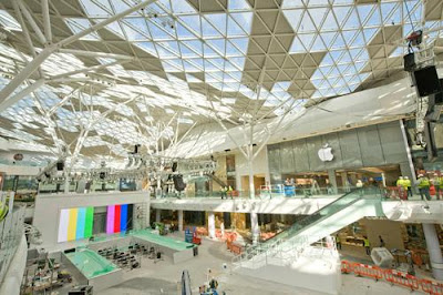
This weekend I visited the shopping centre Westfield, for the first time.When I first drew up to it, in the car, it looked massive, like an awesome glass dome, and it made me feel really excited to get inside.


We parked the car, taking advantage of the 2 hours free parking, and noticed that the parking system is really useful, it has a green light over free spaces,a nd a red light over full ones, meaning that you dont have to waste time cruising in the hope of finding a space.

We entered Westfield through "The Village," the high end part of Westfield containing the really posh shop, such as Prada, De Beers, Hugo Boss etc. I have to say that if I was spending that kind of cash, that place would really make me feel at home, it is a lovely high end shopping experience.


We walked through the village, and came to the main shopping centre. It is a massive, open, light space that makes it feel very Mediterranean oddly, and kind of like you're outside. It is not cramped, there is food availiable everywhere, and I really enjoyed shopping there.


I am told that Westfield has a retail floor area of 150,000m² making it the largest shopping centre in London, and the third largest in the UK.

I thought Westfield was incredible, and had a large array of different shops and experiences. I hope it does well, in making London some money, being an attraction for tourists, and hopefully creating jobs and making money to help draw us out of this "credit crunch."

Friday 19 June 2009

Ha-Bua (The Bubble)


Ha-Bua, translated as "The Bubble" is the newest film from acclaimed director Eytan Fox. This is the second Fox film i've seen, and it definitely lived up to the last one, "Walk on Water."

The Bubble is based around life in Tel Aviv, personally my favourite city in Israel, also known as the gay capital of Israel.

It depicts the relationship of the 4 main characters, and the difficulties they face. However, this is not just an account of love, all the time there is the story of the war still raging between Israel and Palestine, brought to our attention by the relationship between Israeli Yali and Arab Ashruf.

This is a beautiful film, with a simple but compelling script, shot simply and wonderfully. If you want to borrow it let me know, its an incredible film with many famous middle easter actors.

Watch the trailer below to get a taster.


Tales From Earthsea - The Book


After seeing the Studio Ghilbli adaption of the book, I bought the story. I have to tell you, if you are interested in fantasy books, Tales of Earthsea is a must. Originally it was a trilogy, and a fourth installment was added two decades later.

Tales is a sometimes dark, but incredible series, taking you into the world of Earthsea, populated by men, women and wizards. It centres around the use of the "True Speech" in which everything has a true name.

You are led through this story by Ged, and his journey through life as he discovers his powers, and evernutally becomes a powerful wizard.

This is not a children's book, it is definitely up there with the works of JRR Tolkien, and worth a read!

Tales From Earthsea

A film I saw last year at the Leeds Hyde Park Cinema was "Tales from Earthsea," the newest Studio Ghibli film. I just purchased it on DVD, so here is my review!


I'm a massive fan of Studio Ghibli, so my expectations were high, being the second only Ghibli film I'd seen in the cinema. I own lots of Miyazaki films, even his first, Castle of Cagliostro. Tales From Earthsea is the directorial debut of Miyazaki's son, Goro. There was much contention over Goro directing this film, and I have to say, I can see why.

The music, and scenery of this film were typical, glorious Studio Ghibli, and didn't disappoint. What did disappoint though, was the storyline. The story was quite hard to follow, and there was very poor character deveopment.

After seeing the film, I went out and bought the book, by fantasy writer Ursula LeGuin, and now I can see why Goro had a hard time cramming it all in. Tales From Earthsea the film is the last installment of LeGuin's books, and the previous history is really important.

Overall, I enjoyed this film but I was recommend you to watch other, classic Miyazaki films first, such as "Spirited Away" or "Nausicaa."

Toshiba

I have been on my Placement Year for 2008/2009, and part of my time was spent at Grey London, an absolutely amazing advertising agency, part of the WPP Group. Amongst other things, they have worked with Toshiba to develop their website and adverts.

The Toshiba website is a completely new website, instead of using the mouse cursor normally, you draw a series of shapes to navigate your way around the website and interact with the website. The shapes do different things to each of the creatures you encounter. It is so much fun, try it for yourself here!

Grey also developed an incredible advertising campaign for the new Toshiba products. They use the "bullet time" technique (seen in the movie "The Matrix") and is dubbed, not as a tv ad, but as a "time sculpture" which shows 10 people filmed doing a range of activities.


You can view the whole video above. As the new girl, I was lucky enough to be the one who packed away all of the 270 video cameras used, with all their wires and accessories, a task that took all day!


Banksy vs. Bristol Museum


Banksy vs. Bristol museum is the new exhibition running for the summer by British "guerilla" graffiti artist Banksy. Banksy has gained notoriety in recent years by using stencils to paint images on a diverse array of outdoor locations. This is the first exhibition in a three storey Edwardian museum.

I haven't had a chance to visit it yet, but I have been lucky enough to glimpse a Banksy, which was on the main road my street runs off, the A1.

I'm actually not the biggest fan of Banksy, I don't like his anti-Israel attitude, however I can appreciate good design, and I still feel honored to have viewed an original artwork.


Thursday 18 June 2009

Post Secret Website

http://postsecret.blogspot.com is a site i've been addicted to for a while. It plays on the inherent nosiness of humans, but instead of being seedy and somewhat taboo, it displays people's secrets in an arty and sometimes beautiful fashion.

These secrets range from the shallow, secrets such as "My secret is I want to be an Outlaw Biker" to the more heavy such as "I haven't spoken to my Dad in 10 years.... and it kills me every day."

People are encouraged to respond to secrets, and so great has this phenomenon become, that Frank, the founder, has set up galleries of postcards, and published books. I received one myself.

I think that the reason this website is so popular, is that people can find pieces of themselves in these little postcards, so take a look and I hope you can find something to relate to.

Other similar, more humorous websites are: secrettweet.com and fmylife.com.

Summer Project Brief

Introduction/Background
In our day-to-day lives we are constantly bombarded by visual stimuli and as designers we have to take advantage of these opportunities in order to develop our awareness towards everything that can stimulate our imagination. Designers feed their creativity from knowledge and understanding of current issues, trends and culture. As a result they often express their creativity by applying personal experiences and knowledge to their work to overcome many design challenges. Inspiration can be fuelled by anything within society ie; films, television, internet, architecture, consumers experiences, and most of all general living. Imagine a world where everyone walks around with blinkers on and only sees things that are under their noses. Now imagine yourself and your limited stimuli, inspiration and experience. Limited knowledge produces repetitive and clichéd designs and most of all constrains the imagination to the extent that all the solutions become similar and predictable. It is a positive way of learning and generating original work.

The Brief
As part of your ongoing creative and cultural development you are required to analyse and critically review any inspirational material that falls in the following categories: books, films, architecture/places, museums, artist, websites/online, designs. Your challenge is to respond critically to at least 35 different things (at least five for each category) that you find interesting and stimulating. Your response must be coherent and logged online into your personal Blog, moreover you’ll have to comment on and discuss other students findings in order to critically start an online crit in which all of you will take part. The approach to this brief has to be professional and your Blog must not to become a collection of summer holiday snaps and a record of your social life/events.